Nilicon Visual Identity
Nilicon is a brand active in the field of concrete production and exposed‑concrete molds—an emerging industry that has gained a significant presence in contemporary architecture and modern design. With the growing interest in raw materials and structural aesthetics, exposed concrete has become an important element in architectural expression, combining durability with a distinctive visual character.
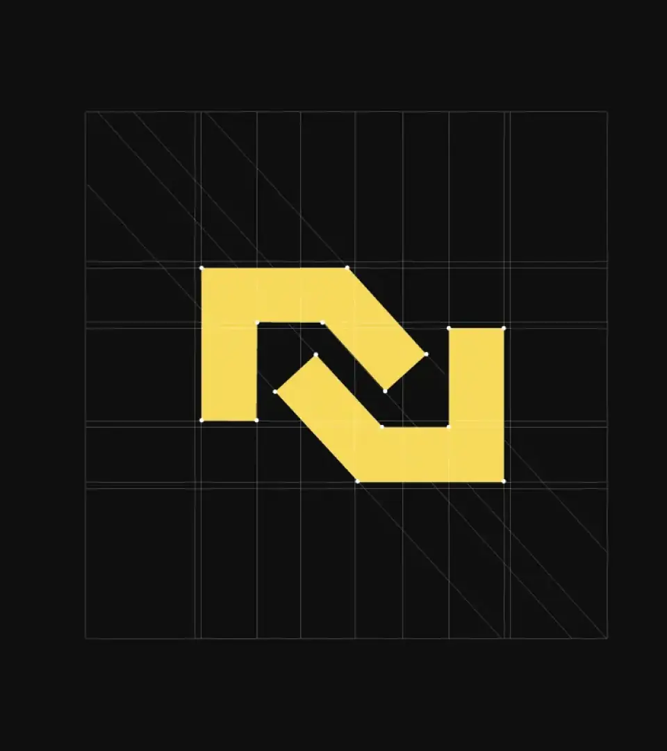
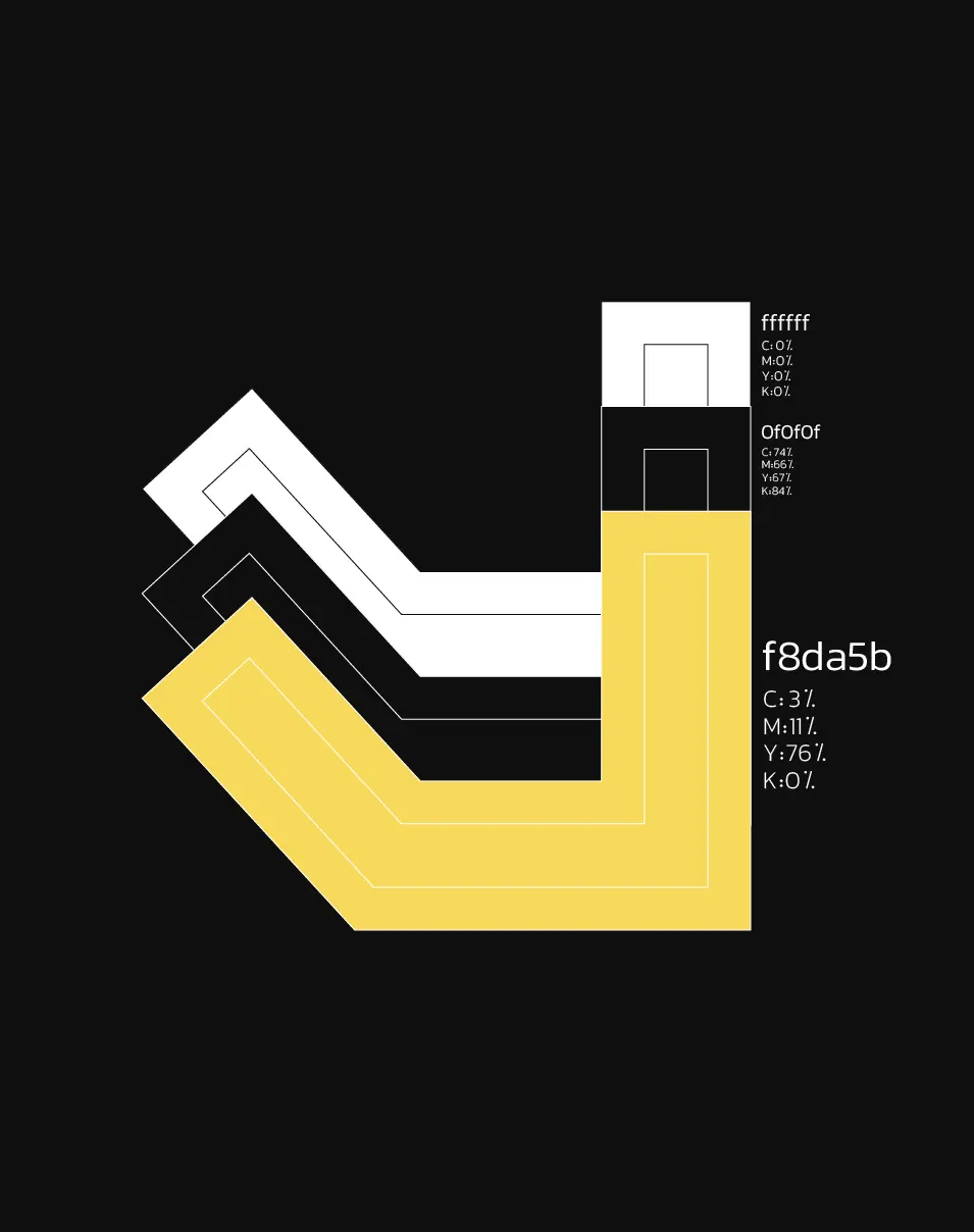
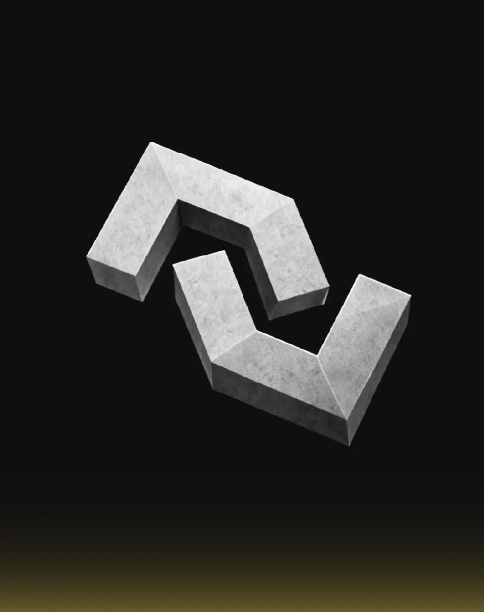
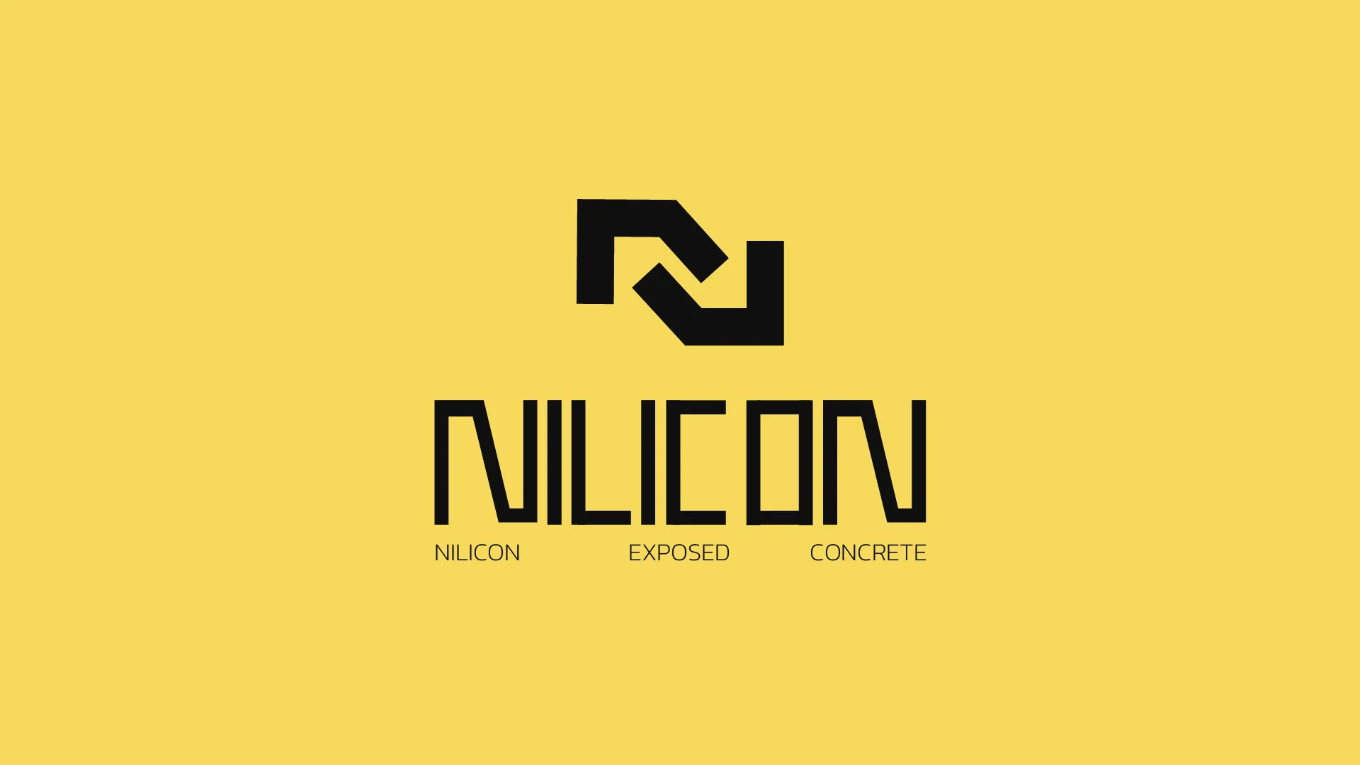
In designing the brand mark, geometric forms inspired by the structural sections and surfaces of exposed concrete were used. When these forms are arranged together, they create the letter “N” within the negative space—directly referencing the name of the brand. The use of negative space not only strengthens the conceptual clarity of the logo but also gives it a minimal, intelligent, and contemporary character that aligns with the aesthetics of modern architectural design.
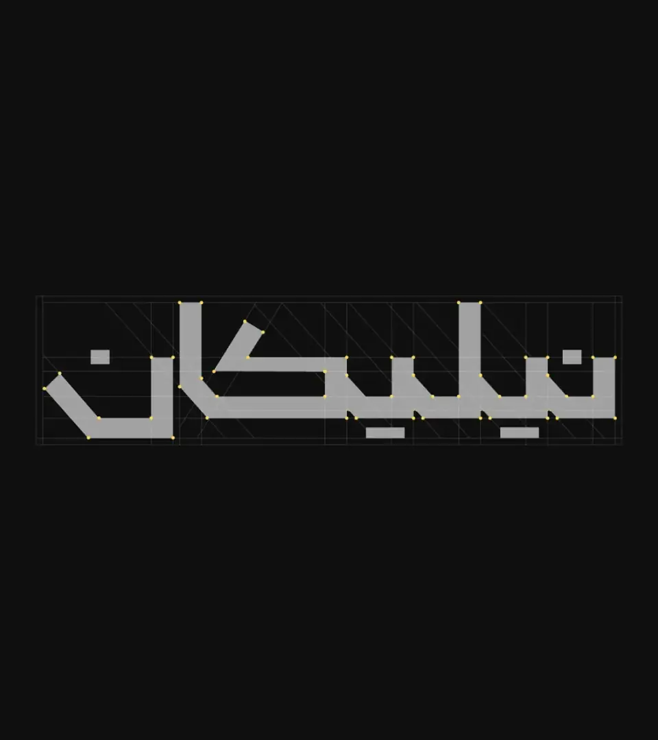
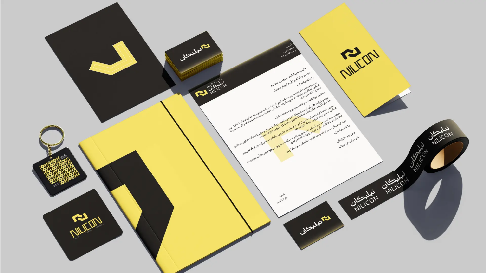
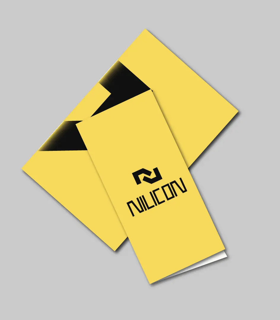
The logotype follows the same visual language as the symbol and is constructed using a similar structural approach. The heavy weight of the letterforms was intentionally chosen to convey the sense of solidity, durability, and mass associated with concrete. These qualities are among the most defining characteristics of the material itself, allowing the visual identity to reflect both the physical and conceptual nature of the industry in which Nilicon operates.